- Retail Industry
- Automobile Industry
- Food and Beverage
- Tech Industry
- Manage Your Brand Logo with MarcomCentral
Get news, updates, and insights delivered straight to your inbox.
The Logo Evolutions of Famous Brands
A face says a lot about a person. A logo is the face of the company’s branding. When done successfully, it should make a strong impression and evoke a specific feeling – just like a face.
A logo is just one part of a brand identity. Yet, it’s often the first encounter a customer has with the company. Whether passing a shop in the mall, driving by, or noticing branding on a web page, a company logo should stand out. A growing brand is dynamic, and sometimes logos require a facelift. Logo redesign is common among even the most well-known brands. Explore logo evolution across industries and the impact it has had on these iconic companies.
Retail Industry
Walmart
For many consumers, Walmart is the one-stop shop for all their needs, from grocery to personal care to home goods. The first Walmart was opened in 1962 by Sam Walton, who wanted to serve customers in rural areas to differentiate the brand from competitors.

Image Source: https://turbologo.com/articles/tevolution-of-famous-logos-over-time/walmart-logo-evolution-2/
The first iteration of the Walmart logo was simple, containing just the name in an easy-to-read blue font. Walmart changed the logo within a few years to lean into its target audience, opting for a Western-inspired black font. This change also brought the hyphenated Wal-Mart, which the brand has toyed with over time.
As the brand continued to grow, it stuck to the black-colored and Western font but added some selling points – “We Sell for Less” and “Satisfaction Guaranteed”. This logo also included the nickname “Discount City”. Walmart’s goal was to remind its primary target audience of its goal – providing affordability of products.
From the 1980s through the 2000s, Walmart moved away from the Western font style in favor of blocky text. Originally, the font color was brown, clinging to the company’s rustic origins. Although the font style stayed the same, the brand returned to blue font, a common color choice for businesses that wish to indicate professionalism. The hyphen also got replaced with a star – a premonition of the upcoming logo design.
In 2008, Walmart introduced its most significant logo redesign. The brand name finally became Walmart with no hyphen or capitalized M. Then came the spark, a more abstract (and distinct) version of the star previously wedged in the name. The Walmart spark isn’t just an interesting design choice. Each of the six Sparklets represents one of Walmart’s values and principles – Customer, Respect, Integrity, Associates, Service, and Excellence.
Amazon
It started small in founder Jeff Bezos’s garage. Now, Amazon is No. 2 on Fortune’s 500 list. Today, Amazon touches nearly every part of a consumer’s life, with services like Amazon Prime, streaming, and partnerships with other brands. The ecommerce giant owes much of its success to its marketing strategy, which of course includes the logo.
Image Source: https://logovent.com/blog/decoding-the-secrets-of-the-amazon-logo/
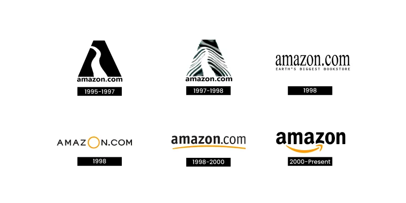
The original logo, created in 1995, showcased a large black A with a white curve winding down to the brand name, amazon.com, leading consumers right to the website. The white curve made from negative space resembled a river, like the Amazon River of the company’s namesake.
The next iteration was heavily influenced by design trends, and the black A was replaced with a zebra print. This is a good example of the importance of color schemes. Whereas the first logo was solid black and white, this design played around too much with color and style, ultimately being distracting.
In 1998, Amazon introduced new designs that began to look more like the logo we see today. Each still contained the brand’s website URL, with two iterations introducing the orange/yellow color that remains part of the brand’s color scheme.
In 2000, Amazon added an element as iconic as the brand itself. Underneath the brand name amazon (all in lowercase) is a yellow-orange smile extending from the first A to the Z. Not only does a smile evoke joy, but the arrow shows the brand is there for its customers, whether it’s product selection or exceptional service, from start to finish.
Automobile Industry
BMW
Automobile brands are among the most recognizable. You see these emblems on trucks, minivans, sedans, and more. One brand that stands out is BMW for the minimal changes to its logo over the years. The first iteration was introduced in 1917, featuring a circular design. An outer black circular band contains the brand name, with the inner circle cut into alternating halves of blue and white.
Image Source: https://1000logos.net/bmw-logo/
Car brands are known for being international, and some consumers prefer American, Japanese, or manufacturers from other countries over others. BMW is German, another popular car manufacturing country. Its logo pays homage to its roots, with blue and white representing the Bavarian flag.
Over the years, little has changed about BMW’s logo. The company switched out gold lettering for the brand name in the outer circle for white and has made slight variations for specific models. BMW is a great example of the staying power of a well-designed and defined logo.
Food and Beverage
McDonald’s
You see one in nearly every U.S. city or town, including countries worldwide. You don’t need a name to know – the golden arches and yellow and red colors let you know it’s a McDonald’s.
Image Source: https://1000logos.net/mcdonalds-logo/
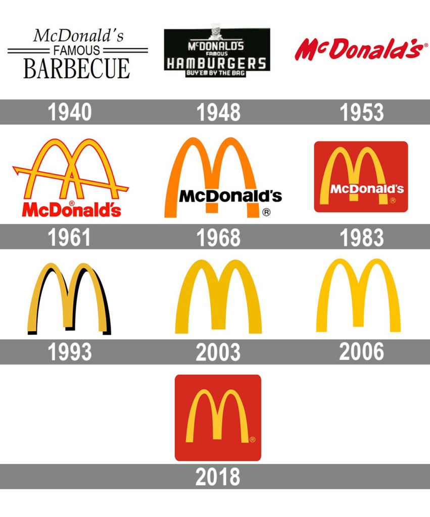
Yet, those golden arches wouldn’t appear until the 1960s. At first, McDonald’s went by a different name, Airdrome, which opened in 1937 as a small food stand in California. When the name changed to McDonald’s, so did the font. The original logo contained the italicized brand name followed by “Famous Barbecue”, highlighting professional typography.
In the late 40s, the brand became McDonald’s Famous Hamburgers. This logo was warmer, with a tagline reading “Buy ‘em by the bag” at the bottom and a smiling mascot at the top. It even indicated the price of these famous burgers – 15¢.
This design was a template for the logo introduced in 1953 when the company finally went by just McDonald’s. The typeface is playful, featuring a red font against a white background. The added phrase “Coast to Coast” indicates the restaurant’s nationwide influence. Perhaps the biggest change is the more fleshed-out mascot, now with a name suggesting McDonald’s fast service – Speedee.
By the 60s, Ray Kroc bought McDonald’s, and with new ownership came the time for rebranding. The McDonald brothers already implemented the golden arches at their restaurant, so the next step was adding those arches to the logo.
The first logo with the golden arches didn’t share a leg, with the legs overlapping in the center and a diagonal line going through the arches. This design was meant to resemble the typical restaurant’s architecture. The company name was included below the arches.
Even as McDonald’s abandoned the idea of every location featuring arches, they remained integral to the logo. Iterations may be with or without the brand name, featuring yellow, red, or both, or even with the tagline – “I’m lovin’ it”. One element always seems to remain – the golden arches creating an M. It’s all customers need to know when they want a convenient, tasty meal.
Coca-Cola
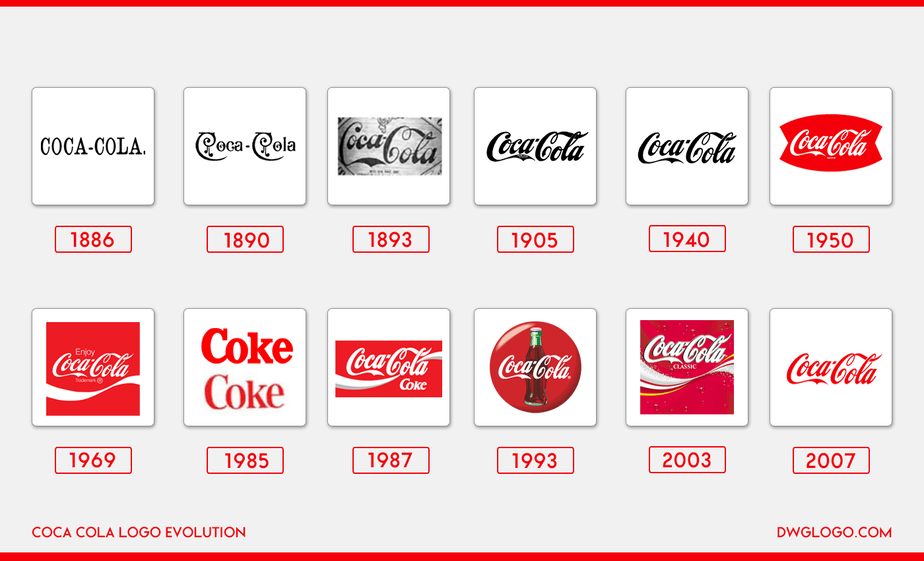
Coca-Cola is among the oldest brands mentioned here and stands out for its iconic logo. You may simply see a soda can or bottle with red and white colors and think about Coca-Cola. Even more surprising is how few changes the brand has made to its logo since it was first introduced in the late 1880s.
Image Source: https://dwglogo.com/coca-cola/
Although the first iteration featured standard font, Coca-Cola quickly transitioned to a more stylized font in 1887 – Spencerian script. This flowing font was popular in the U.S. for official correspondence before the invention of the typewriter and evokes a dramatic feel.
The brand continued refining the logo, soon introducing the red font that Coca-Cola is recognized for today. In the 1940s, Coca-Cola settled on a typeface that remains the template for its branding. One of the most notable logo changes came in 1969 when Coca-Cola added the white wave. This graphic design element grew more dynamic in further iterations, with it sometimes appearing below and going through the brand name.
Other, much younger brands have already implemented new logos shortly after their initial launch. What makes Coca-Cola’s logo so longstanding? Perhaps it’s the simplicity of its product – a cool, refreshing beverage. Customers know and trust the Coca-Cola brand, and maintaining a similar logo throughout the years indicates the company’s commitment to its identity.
Tech Industry
Apple
Today, it’s hard to imagine a world without Apple products. We carry iPhones in our pockets, use MacBooks at home, and stream shows and movies through Apple TV. As with the other brands mentioned, Apple isn’t just known for its innovative and convenient offerings. You see the apple with the bite out of it and you instantly think of the brand.
Image Source: https://www.tailorbrands.com/blog/apple-logo
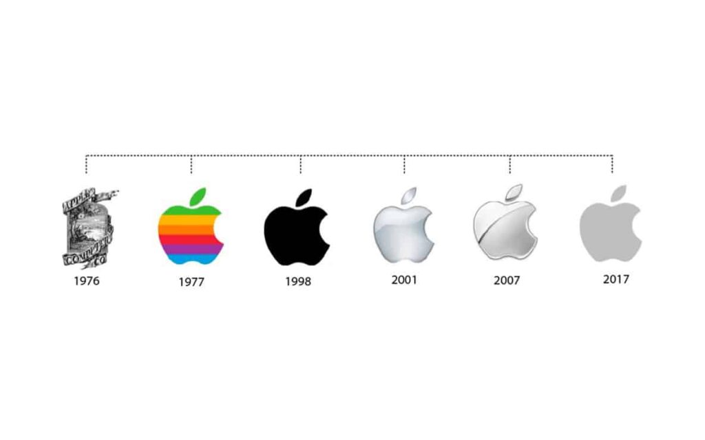
The first logo, created by co-founder Ronald Wayne in 1976, was very different than the apple of today but maintained the same inspiration. It featured a black-and-white illustration of Isaac Newton sitting under a tree, an apple poised directly above him (and the rest is history). While unique, this logo was old-fashioned and conflicted with the brand’s identity. It was quickly replaced with just the apple.
The second Apple logo showcased a rainbow-colored apple, indicating the brand’s emphasis on innovation in computer design. Despite some theories about the reason for the bite, it was more practical. Apple founders wanted to ensure it wasn’t confused with a cherry.
Steve Jobs, who temporarily left Apple but returned in the late 1990s as the company faced challenges, saw an opportunity to modify the logo again. Motivated by an interest in skeuomorphism, Jobs encouraged Apple to transition away from the rainbow to solid black. This made Apple products sleeker, with designs that felt familiar even when encountering them for the first time.
This trend continued into the 2000s, with Apple changing its logo to reflect the composition of its products. For example, in 2007, the Apple logo sported a chrome-textured design to complement its suite of aluminum-based tech products. Although the bitten apple has remained, the current logo has moved away from a glassy shine for a simplistic, flat design. The logo pairs well with Apple’s low-carbon aluminum products, plus its modern and stylish brand identity.
Microsoft
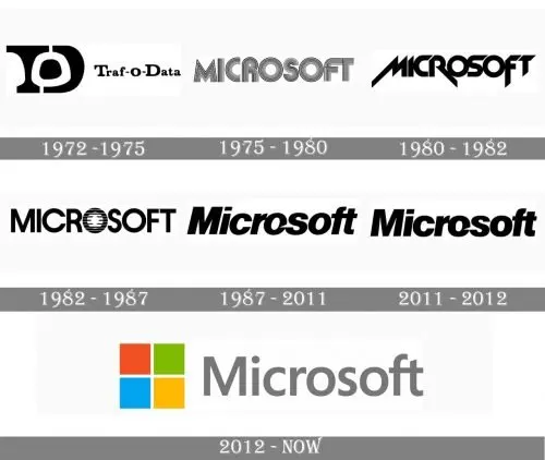
Since Bill Gates and Paul Allen started their company in 1975, Microsoft has become one of the most noteworthy software firms in the world. Its logo reflects this development.
Image Source: https://www.andacademy.com/resources/blog/graphic-design/business-logo-design-examples/
The first logo was indicative of trends at the time. It simply featured the company name using a common font of the Disco era. Of course, the Disco era passed, and Microsoft was once again inspired by the music at the time. This logo mimicked font styles used by heavy metal bands.
Microsoft then focused on making the logo its own. The 1982 redesign is most notable for the “Blibbet” element of the middle “O” in Microsoft. Popular among customers and employees, the “Blibbet” was distinct and memorable. No longer was Microsoft influenced solely by trends in pop culture. It wanted to become its own.
The next iteration came in 1987 and remained the Microsoft logo into the early 2010s. The lettering became rounder and bolder. Once again, the center “O” got special treatment. This time, a small slash cut through its side. Somewhat resembling Pac-Man, this design element also signaled something about the brand – motion and speed. It suggested a company that’s confident about its place in the computer space.
Finally, Microsoft changed its logo again in 2012, this time making the most significant changes yet. Touting arguably its most famous offering – Windows – Microsoft added an icon of four squares of red, green, blue, and yellow, creating a shape that resembles a window. More than just an eye-catching image, this logo highlights its suite of software products, with each color representing a different product.
Manage Your Brand Logo with MarcomCentral
What’s your brand’s visual identity? Will you choose a minimalist design, or will your logo play with words and graphic design elements? Do you want your logo to be known for its icon, such as the Nike logo’s swoosh? Perhaps you’ll play with a logo maker for inspiration. Whatever your first logo looks like, understand it’s likely to evolve.
Although logo changes are inevitable, you still want to ensure consistency with your visual identity across all marketing and sales channels. At MarcomCentral, we offer an on-demand platform for full-service brand management and distributed marketing. MarcomCentral centralizes operations and offers custom templates for dispersed teams, ensuring all materials uphold company and industry standards. Integrate our platform with the tools you use every day and leverage analytics to continually improve. Contact us to learn more or request a demo today.
You might also like

